Sampler Periodic
Full script
import math
from fnpcell import all as fp
from gpdk.technology import get_technology


if __name__ == "__main__":
    # fixed template start
    from pathlib import Path
    gds_file = Path(__file__).parent / "local" / Path(__file__).with_suffix(".gds").name
    library = fp.Library()
    TECH = get_technology()
    from gpdk.geometry.sampler_periodic import SamplerPeriodic

    path = fp.g.Polyline([(0.0, 0.0), (30.0, 0.0), (30.0, 20.0), (15.0, 30.0)])

    def content_for_sample2(sample: fp.SampleInfo):
        x, y = sample.position
        orientation = sample.orientation
        distance = 2
        dx = distance * math.cos(orientation + math.pi / 2)
        dy = distance * math.sin(orientation + math.pi / 2)
        return fp.Composite(
            fp.el.Rect(width=2, height=2, layer=TECH.LAYER.M1_DRW).translated(x + dx, y + dy),
            fp.el.Rect(width=2, height=2, layer=TECH.LAYER.M1_DRW).translated(x - dx, y - dy),
        )

    def content_for_sample1(sample: fp.SampleInfo):
        x, y = sample.position
        print(x, y)
        return fp.el.Rect(width=2, height=2, layer=TECH.LAYER.M1_DRW).translated(x, y)
    sampler = SamplerPeriodic(period=5, reserved_ends=(5, 5))
    mlt = TECH.METAL.MT.W20.updated(line_width=10)
    library += mlt(curve=path).with_patches(content_for_sample2(sample) for sample in sampler(path))
    r1, r2 = path.bundle(size=2, spacing=2 + 2)
    library += mlt(curve=path).with_patches([content_for_sample1(sample) for sample in sampler(r1) + sampler(r2)]).translated(40, 0)
    fp.export_gds(library, file=gds_file)
    fp.plot(library)
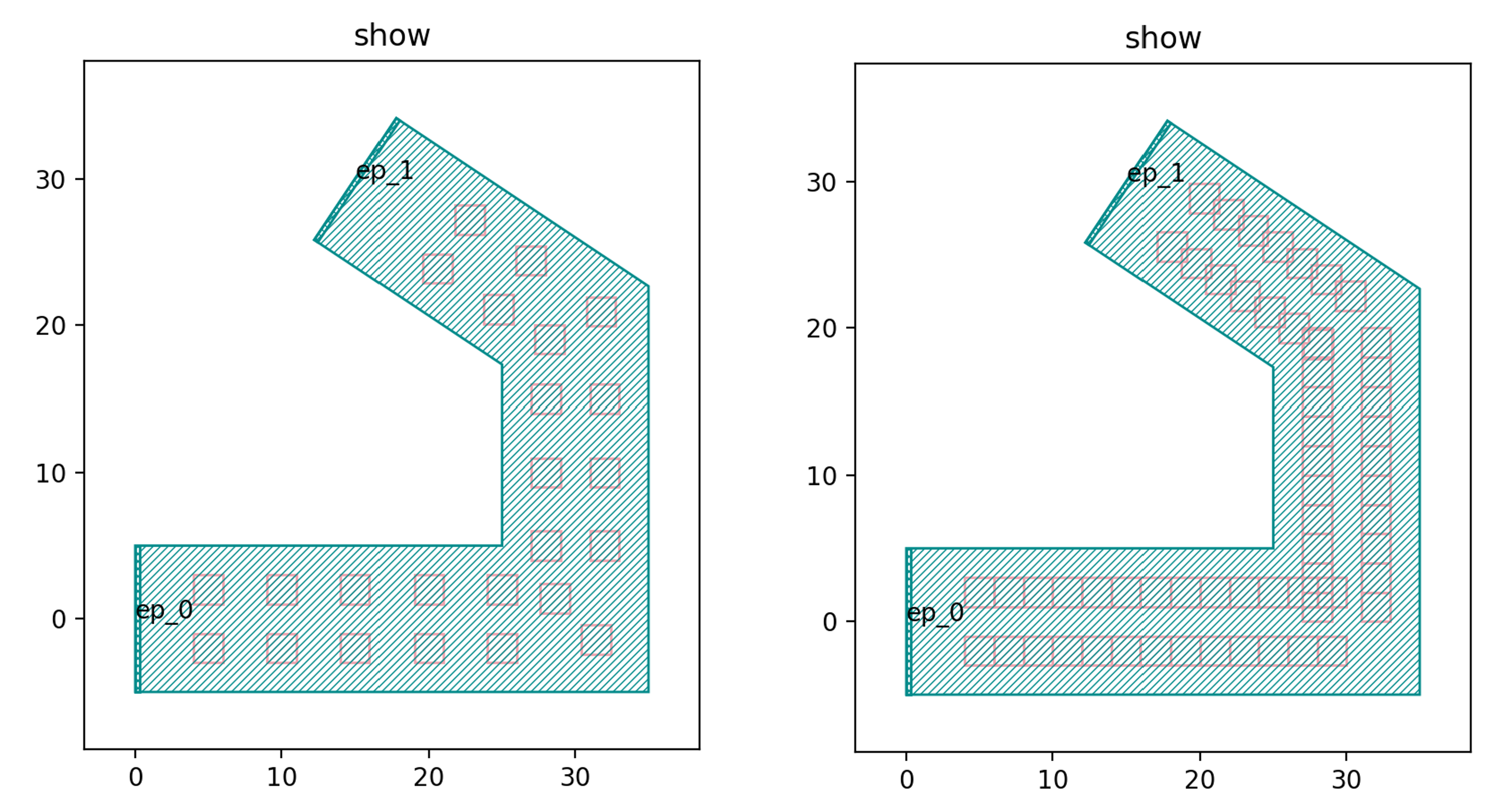
Running the full script will generate the following two graphics.
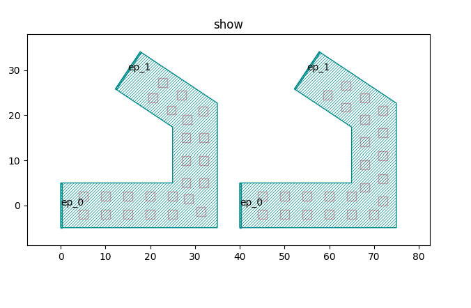
We will describe the code that generates each of the two graphs, starting with a test of the code that generates the left graph.
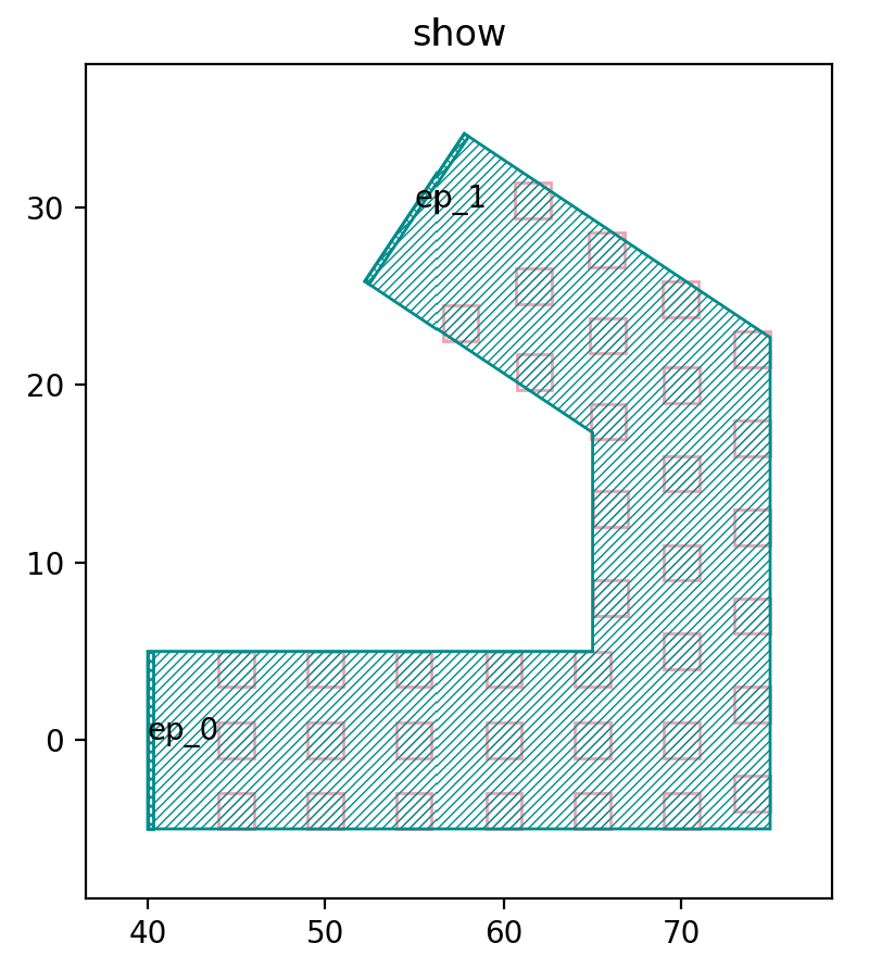
Left graph
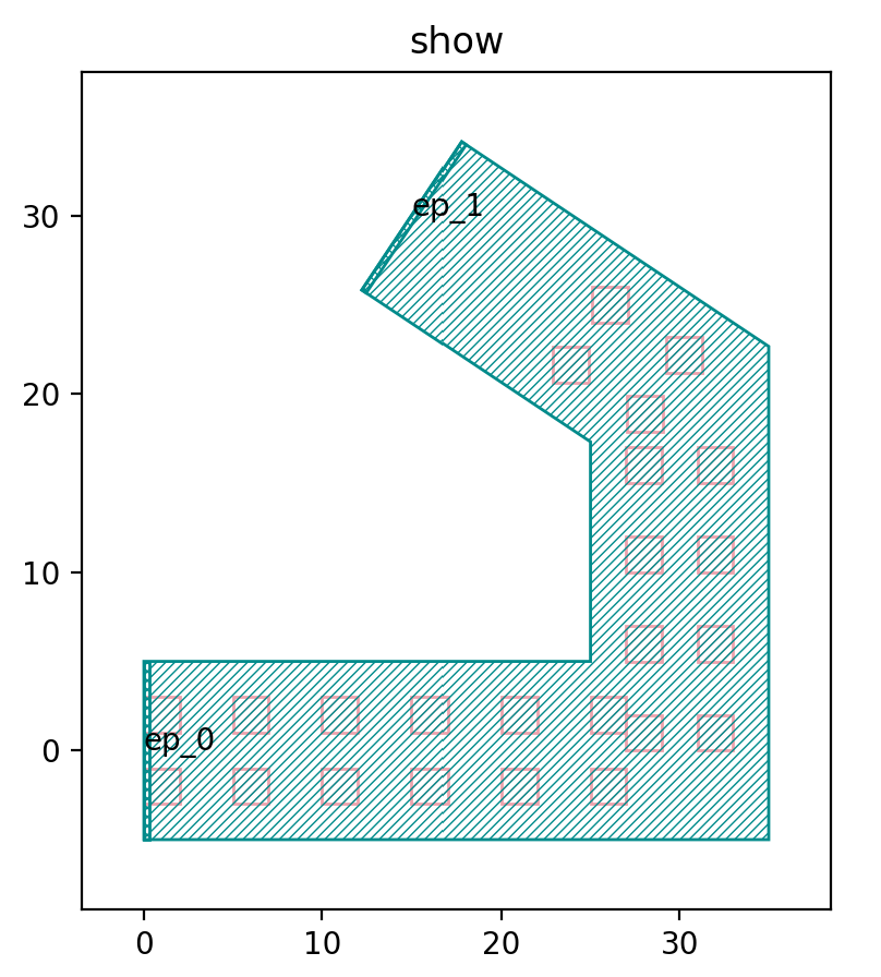
Below is the waypoint of the whole graph, we will adjust the path for before and after comparison.
path = fp.g.Polyline([(0.0, 0.0), (30.0, 0.0), (30.0, 20.0), (15.0, 30.0)]) # original path
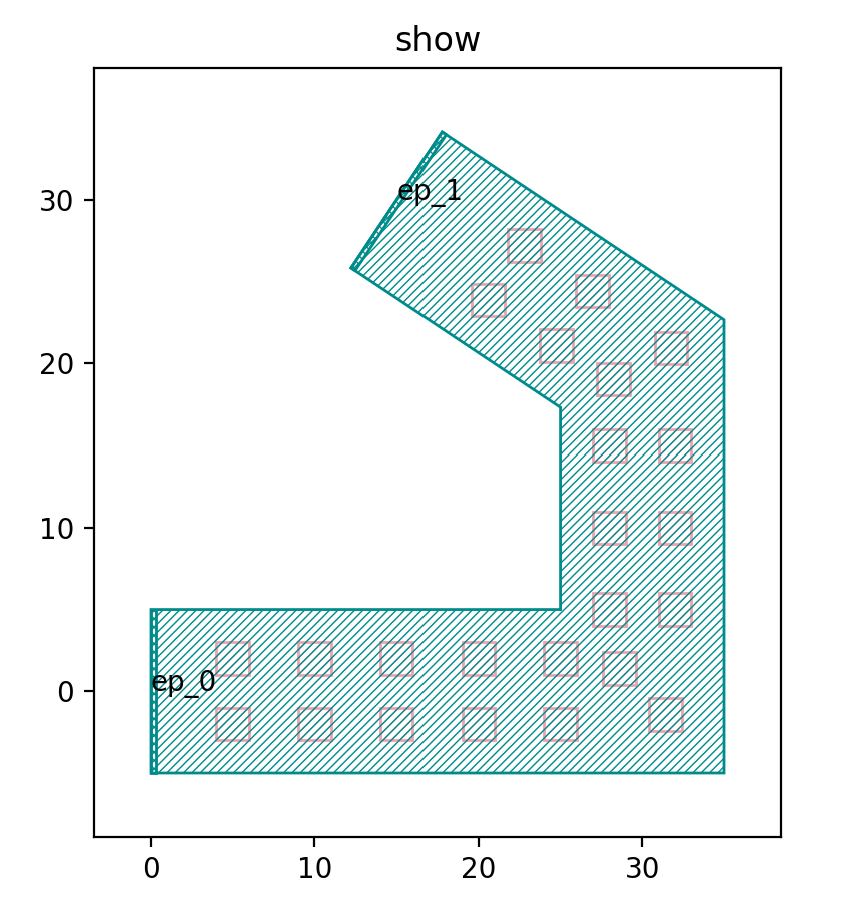
Then we adjust the path and run the script again.
path = fp.g.Polyline([(0.0, 5.0), (30.0, 0.0), (30.0, 20.0), (15.0, 30.0)])
The following functions are defined to generate the rectangular arrays in the left-hand graph.
def content_for_sample2(sample: fp.SampleInfo):
  x, y = sample.position
  orientation = sample.orientation
  distance = 2
  dx = distance * math.cos(orientation + math.pi / 2)
  dy = distance * math.sin(orientation + math.pi / 2)
  return fp.Composite(
      fp.el.Rect(width=2, height=2, layer=TECH.LAYER.M1_DRW).translated(x + dx, y + dy),
      fp.el.Rect(width=2, height=2, layer=TECH.LAYER.M1_DRW).translated(x - dx, y - dy),
  )
Inside the function, x, y get the horizontal and vertical coordinates of the sample points respectively; orientation gets the direction of the sample points; dx, dy are the functions that define the distance between the two columns of the graph; the shape and position of the two columns of the array graph are defined in fp.Composite.
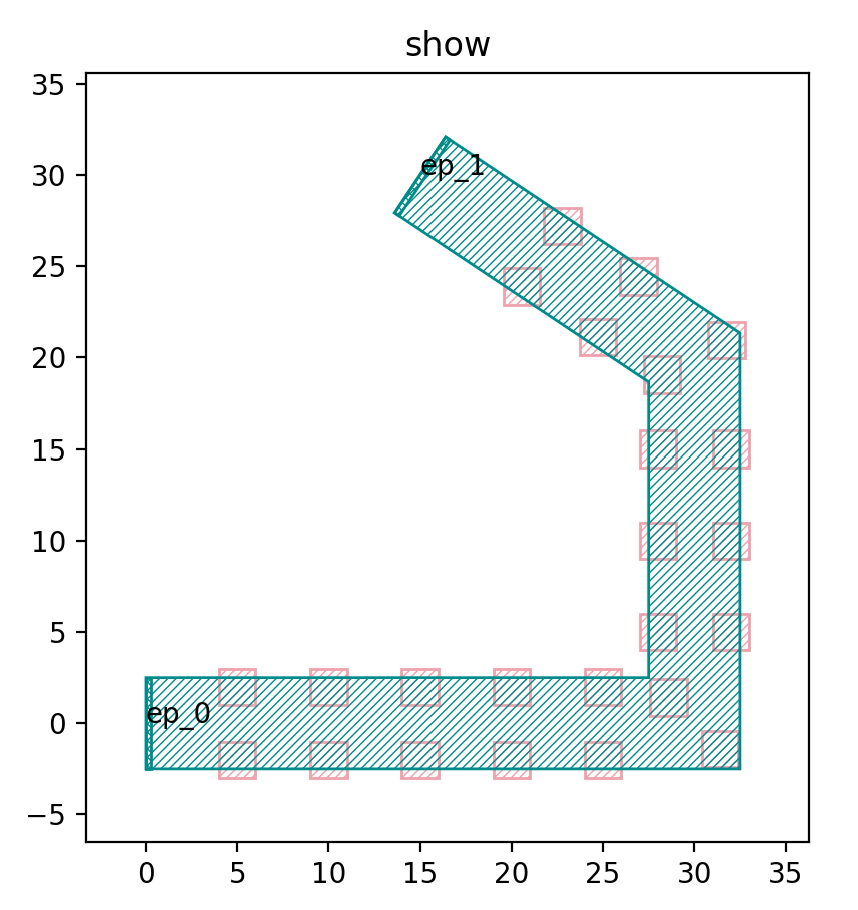
We then adjust the distance value to 5, from the following figure can be seen that the spacing between the two columns of graphics increases.
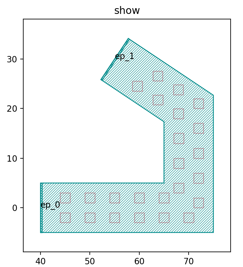
SamplerPeriodic is a function used to generate periodic sampling points, where the period is the spacing period of the graph, we will change it to 2 for comparison, the period of the left graph in the figure below is 5, and the period of the right graph is 2.
sampler = SamplerPeriodic(period=5, reserved_ends=(5, 5))
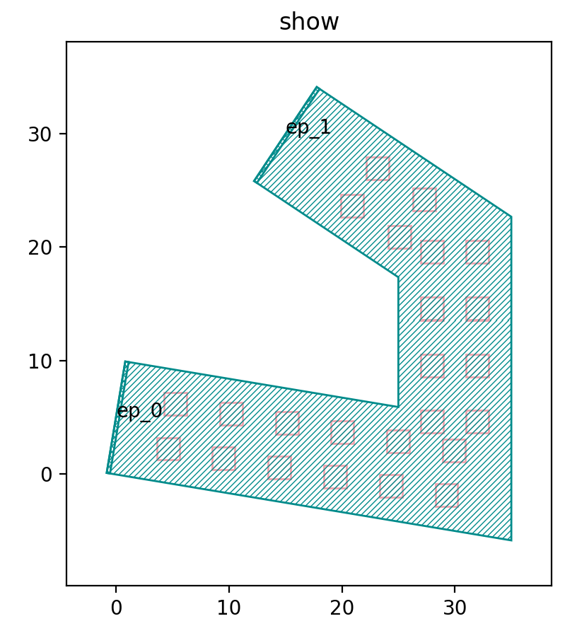
The reserved_ends parameter in the SamplerPeriodic function is used to control the position of the initial and end points of each column of sampling points. Below we change reserved_ends=(5, 5) to reserved_ends=(1, 8). From the figure below, we can see that the end positions are shortened by 8 and the initial end positions are shortened by only 1, indicating that the first value in the parentheses is used to control the initial end, while the second value is used to control the end.
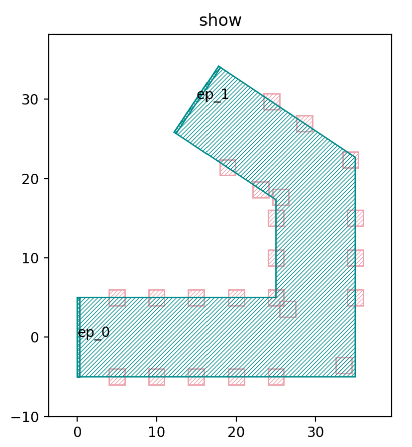
The following script is used to adjust the width of the area, which was 10 before, and we run the script after adjusting it to 5.
mlt = TECH.METAL.MT.W20.updated(line_width=5)
As you can see in the figure above, the width of the green area has changed to 5, which is significantly narrower than the original 10.
Right graph
The generated array is returned by passing sample points to the following functions.
def content_for_sample1(sample: fp.SampleInfo):
  x, y = sample.position
    return fp.el.Rect(width=2, height=2, layer=TECH.LAYER.M1_DRW).translated(x, y)
The difference with the function that generates the left side of the graph is that the function that generates the right side of the graph only generates a single column array of graphs, and the following procedure can be used to generate multiple columns of graphs.
r1, r2 = path.bundle(size=2, spacing=4)
library += mlt(curve=path).with_patches([content_for_sample1(sample) for sample in sampler(r1) + sampler(r2)]).translated(40, 0)
In the above script, the size of the bundle function is the number of columns to be generated, and the spacing is the spacing between columns; then the graph is laid out by line path using the with_patches function. Below we change the script to generate three columns of graphs.
r1, r2, r3 = path.bundle(size=3, spacing=4)
library += mlt(curve=path).with_patches([content_for_sample1(sample) for sample in sampler(r1) + sampler(r2) + sampler(r3)]).translated(40, 0)
The above example is used to generate an array of shapes along the line segment path.